Building UI Supporting Various Pixel Densities & App Display Sizes
Last Updated 2025-08-11 UTC+8.
The user interface (UI) is the crucial point of interaction between our app and its users. It is paramount that our UI is visually appealing to create a positive first impression and ensure a smooth user experience (UX). As a developer, it is essential to address various factors, ensuring the UI functions seamlessly across devices with diverse pixel densities and screen sizes. This blog post explains the basics to build UI using the Views UI framework.
Support Various Pixel Densities
dp and sp for Dimensions
Pixels refer to physical dots on a screen. Different screens could have different pixel densities, meaning the number of pixels used to represent the same physical area may differ across screens. It's about how densely packed the pixels are in the same physical area. A screen with higher pixel density displays its content in more detail, making it appear clearer and less blurry.
Since screens can have different pixel densities, specifying our UI components in pixels could result in inconsistent physical sizes across screens. For example, a width of 50px might look significantly shorter on a screen with higher pixel density than on one with lower density. This is why we need a pixel-density-independent unit called density-independent pixels (dp / dip) (also known as logical pixel densities), where 1dp has approximately the same physical size across all screens with different pixel densities. This means that a width of 50dp would have a similar size on screens with both higher and lower pixel densities.
On the other hand, for text, we have another pixel-density-independent unit called scalable pixels (sp), which is essentially the same as dp but resizes based on the user's text size preference in their device's settings.
TIP
Avoid using sp for layout sizes; reserve it solely for text. Likewise, for dp, it is preferable not to use it for text; instead, utilize it exclusively for layout sizes.
In Android, for simplification purposes, we typically categorize screens based on their pixel densities, known as density buckets:
| Density Bucket | Pixel Densities (dpi) | Scale | Density-Independent Pixels (dp / dip) |
|---|---|---|---|
| ldpi | 120 | 0.75x | 1dp = 0.75px |
| mdpi (base) | 160 | 1x | 1dp = 1px |
| hdpi | 240 | 1.5x | 1dp = 1.5px |
| xhdpi | 320 | 2x | 1dp = 2px |
| xxhdpi | 480 | 3x | 1dp = 3px |
| xxxhdpi | 640 | 4x | 1dp = 4px |
From the table above, dpi stands for dots per inch, where 1 dpi means there is only 1 pixel in an inch. Our standardized unit, dp, is taking 160 dpi as the base, meaning that 1dp = 1px on a 160 dpi screen. To provide concrete examples for visualization, consider the following comparisons to grasp the size of 1 dp:
| dp | inch | mm | cm |
|---|---|---|---|
| 1 | 1/160 | 0.15875 | 0.015875 |
| 4 | 1/40 | 0.635 | 0.0635 |
| 8 | 1/20 | 1.27 | 0.127 |
| 16 | 0.1 | 2.54 | 0.254 |
| 32 | 0.2 | 5.08 | 0.508 |
| 64 | 0.4 | 10.16 | 1.016 |
| 128 | 0.8 | 20.32 | 2.032 |
| 160 | 1 | 25.4 | 2.54 |
TIP
When designing a UI interface, we could handle the dimension values using this approach:
- Consider how large we want it to be in the physical world, e.g., 3cm.
- Convert it to
dpwith the formula1 dp = 2.54/160 cmor1cm = 160/2.54 dp. E.g., 3cm = 160/2.54 * 3 ~= 189 dp.
In this way, the UI component would be having the desired physical size as we want.
TIP
When specifying sizes in Kotlin code, sometimes we need to use pixel representation instead. In that case:
- Use Android API to convert
dporspintopxunit, e.g.TypedValue.applyDimension(...); or, - Get the pixel representation of a dimension value directly from
dimens.xmlusing e.g.,resources.getDimension(R.dimen.XXX).
TIP
For common configs in Android system, e.g., scroll bar size, we can use ViewConfiguration.get(mContext).XXX to obtain them.
Vector Drawables
For simple images or icons, utilizing vector graphics is preferable. With vector graphics, the image is described in code, enabling it to be scaled to any size without encountering scaling artifacts. This approach requires only a single file to effectively accommodate various pixel densities, unlike bitmap drawables.
TIP
From our design file / our UI designer, we could obtain a SVG file of an image or icon. Then, we can convert it from SVG to vector graphics (XML) file using the Vector Asset Studio of Android Studio.
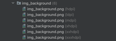
Bitmap Drawables
For more complex images, opt for bitmap drawables such as PNGs. However, unlike vector drawables, it is essential to maintain a variety of alternatives tailored to different pixel density groups:
TIP
When determining the size of an image and prepare the image files, we could:
Consider how large we want it to be in the physical world, e.g., 1.016cm.
Convert it to
dpwith the formula1 dp = 2.54/160 cmor1cm = 160/2.54 dp. E.g., 1.016cm = 160/2.54 * 1.016 ~= 64 dp.Calculate the
pxrequired for each group of pixel densities. For example, if we want a 64dp x 64dp image:Density Bucket Dimension in Pixels (px) ldpi 48px x 48px (where 64 = 64 x 0.75) mdpi 64px x 64px (where 64 = 64 x 1) hdpi 96px x 96px (where 96 = 64 x 1.5) xhdpi 128px x 128px (where 128 = 64 x 2) xxhdpi 192px x 192px (where 192 = 64 x 3) xxxhdpi 256px x 256px (where 256 = 64 x 4) Prepare the images based on the calculated dimensions in pixels and import it into our project.
TIP
As a general practice, place images in the drawables package. However, for the app icon, store it in the mipmap folder instead. Some app launchers may present the app icon in a larger size. If the icon is placed in the drawables folder and the device has an hdpi screen, Android might scale up the hdpi image even if larger images are specified in the xxhdpi or xxxhdpi folder, potentially resulting in scaling artifacts.
The mipmap folder is preserved in all APKs, including density-specific ones. This allows the app launcher to select the appropriate app icon file for display without encountering scaling artifacts, regardless of the required size.
Support Various App Display Sizes
Why is it necessary to address variations in app display size in addition to pixel densities?
By utilizing dp, sp, vector drawables, and sets of bitmap drawables, we can ensure that layouts and text appear consistent in physical size across screens with varying pixel densities. However, differences in app display sizes necessitate adjusting the physical sizes of layouts and text accordingly.
To illustrate the issues that may arise when failing to address differences in app display sizes:
<?xml version="1.0" encoding="utf-8"?>
<androidx.constraintlayout.widget.ConstraintLayout xmlns:android="http://schemas.android.com/apk/res/android"
    xmlns:app="http://schemas.android.com/apk/res-auto"
    xmlns:tools="http://schemas.android.com/tools"
    android:layout_width="match_parent"
    android:layout_height="match_parent"
    android:background="@color/white"
    tools:context=".splash.presentation.MainActivity">

    <TextView
        android:id="@+id/heading1"
        android:layout_width="wrap_content"
        android:layout_height="wrap_content"
        android:text="Heading 1"
        android:textSize="36sp"
        android:layout_marginTop="24dp"
        android:layout_marginStart="24dp"
        app:layout_constraintTop_toTopOf="parent"
        app:layout_constraintStart_toStartOf="parent"/>

    <TextView
        android:id="@+id/body"
        android:layout_width="match_parent"
        android:layout_height="wrap_content"
        android:text="This is a body text. This is a body text. This is a body text. This is a body text. This is a body text. This is a body text."
        android:layout_marginTop="24dp"
        android:layout_marginHorizontal="24dp"
        app:layout_constraintTop_toBottomOf="@id/heading1"
        app:layout_constraintStart_toStartOf="parent"
        app:layout_constraintEnd_toEndOf="parent" />

    <ImageView
        android:id="@+id/image"
        android:layout_width="200dp"
        android:layout_height="200dp"
        app:layout_constraintTop_toBottomOf="@id/body"
        android:layout_marginTop="36dp"
        app:layout_constraintStart_toStartOf="parent"
        app:layout_constraintEnd_toEndOf="parent"
        android:src="@drawable/zic_test_test_icon" />

    <Button
        android:layout_width="200dp"
        android:layout_height="wrap_content"
        android:text="Button"
        android:layout_marginTop="24dp"
        app:layout_constraintTop_toBottomOf="@id/image"
        app:layout_constraintStart_toStartOf="parent"
        app:layout_constraintEnd_toEndOf="parent" />


</androidx.constraintlayout.widget.ConstraintLayout>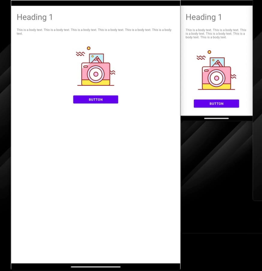
In the above example, we employed dp, sp, and vector drawables to manage the layouts and text sizes, ensuring that elements have consistent physical dimensions. While the user interface may appear well-designed on a phone, it may not adequately fill the screen on a tablet, resulting in excessive white space that appears awkward.
This situation represents just one potential challenge among many. For instance, app display areas that are too small to accommodate all specified UI components pose another issue. Hence, it is crucial to consistently address app display sizes to optimize the user experience.
TIP
I am using the term 'app display sizes/areas' instead of 'screen sizes' because what truly matters in app development is the available area designated for the app's display. This distinction is crucial due to the prevalence of factors like foldable devices and multi-window modes in practical scenarios.
Responsive Design & Adaptive Design
To handle various app display sizes, we could use a combination of responsive design (making minor layout adjustments to fill up space efficiently) and adaptive design (substituting entire layouts to suit various display sizes). These approaches are often implemented concurrently to ensure optimal usability across different devices and app display sizes.
TIP
Responsive Design should be implemented in all view-based projects with the following guidelines:
- Whenever feasible, utilize
ConstraintLayout, incorporating features like chains and guidelines for flexible layouts. - Set layout width and height to one of the following options:
wrap_content,match_parent, or0dp(match constraint). - For layouts with many content, use a
ScrollViewto ensure all components are accessible, even on smaller screens.
TIP
Adaptive Design strategies could vary from project to project. It involves customizing layouts to fit various display sizes efficiently. One approach is to utilize resource qualifiers, e.g., -wXXXdp, -hXXXdp, -swXXXdp, etc. Please refer to the Android Developers Doc for more details.
Tradeoffs in Layout Decisions
Certainly, while accommodating all screen sizes worldwide would be ideal, the decision to pursue this goal hinges on the specific project demands and limitations. For instance, if our target audience comprises a particular team within our organization, with precise knowledge of the device model(s) they use and the conditions (e.g., portrait orientation) in which they operate, we can streamline our efforts by tailoring our optimization to suit those specific devices or conditions. Striving for the 'perfect' code may not always be the answer, but optimizing our code for its intended use cases is invariably the optimal approach.
In this blog post, I won't talk about the 'perfect' approach (I may have another blog post talking about that later). For now, if you are interested in that, please refer back to the Android Developers Documentation from Google.
TIP
Understand your project requirements thoroughly, and if needed, consult with the relevant teams to ascertain the most effective approach for making layout decisions.
Case Study: App with Restricted Requirements
In a project with the following specifications:
- Only supports portrait mode
- Exclusive to phones and tablets
- Multi-window mode disabled
- Same UI layout across phones and tablets
Contrary to the Android Documentation's recommendation to "Avoid using physical hardware values for making layout decisions", in this project scenario, utilizing physical hardware values for layout decisions is reasonable. Specifically, employing the smallest-width resource qualifier in dimens.xml can effectively address varying screen sizes.
Typical Screen Sizes
According to the Android Developer Docs, we have the following typical screen sizes:
| Smallest Width | Description |
|---|---|
| 320 dp | Small phone screen (240x320 ldpi, 320x480 mdpi, 480x800 hdpi, etc.) |
| 480 dp | Large phone screen ~5" (480x800 mdpi) |
| 600 dp | 7" tablet (600x1024 mdpi) |
| 720 dp | 10" tablet (720x1280 mdpi, 800x1280 mdpi, etc.) |
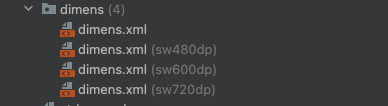
We could prepare the dimens.xml for devices with these 4 groups of smallest width, for example:
TIP
It's advisable to centralize all dimensions used in the project within the dimens.xml file. To facilitate adjustments for different -swXXXdp dimens files, consider devising a general formula to convert base dimensions into those for other -swXXXdp files. For instance, you could use a formula like sw480dpDimen = baseDimen * 480 / swOnTestDeviceForBase * n% (determine n yourself via testing on various devices) for effective scaling. You could derive other formula too if this doesn't work well.
References
- Android Developers. (2025, July 27). Support different pixel densities. https://developer.android.com/training/multiscreen/screendensities
- Android Developers. (2025, July 27). Responsive/adaptive design with views. https://developer.android.com/develop/ui/views/layout/responsive-adaptive-design-with-views
- Android Developers. (2025, August 22). Support different display sizes | Jetpack Compose. https://developer.android.com/develop/ui/compose/layouts/adaptive/support-different-display-sizes
- Mirego. (2021, April 20). Android smallest-width resource qualifier. https://craft.mirego.com/2021-04-20-android-smallest-width-resource-qualifier